Introduction
What is GNU Plot?
Gnu plot is a portable, free, command-driven, interactive function, and data plotting program for Linux, OS/2, MS Windows, OSX, VMS, and many other platforms. Although copyrighted, the source code is freely available. It was initially developed to enable researchers and students to interactively visualize mathematical functions and data, but it has since expanded to cover a wide range of non-interactive purposes, including web scripting.
Third-party programs like Octave also use it as a plotting engine. Numerous plot types are supported by Gnu plot in both 2D and 3D. It can draw utilizing a variety of associated text as well as lines, points, boxes, contours, vector fields, and surfaces. Additionally, it supports a number of specialty plot kinds. Gnu plot provides output in a variety of file formats like eps, emf, fig, jpeg, LaTeX, pdf, png, postscript, etc.
Why use GNU Plot?
- Cross-Platform Compatibility: Works on Windows, macOS, and Linux.
- Supports Various Data Formats: Can read data from files, functions, or mathematical expressions.
- Multiple Plot Types: Line graphs, scatter plots, histograms, 3D plots, and more.
- Customizable Output: Modify colors, labels, titles, and grid settings easily.
- Integration with Other Tools: Can be used with Python, MATLAB, LaTeX, and other programming languages.
Who Uses GNU Plot?
- Scientists and Researchers: To graph experimental data.
- Engineers: To plot equations and model design.
- Students: As an educational tool for graphing mathematics.
- Data Analysts: To investigate trends and relationships within datasets.
Installation & Setup
Windows
- Download Gnuplot from the official website.
- Run the installer and follow the on-screen instructions.
- (Optional) Add Gnuplot to the system PATH for command-line access.
Linux
- Open the terminal and use the package manager:
sudo apt update && sudo apt install gnuplot  #Ubunty/Debian
sudo gnf install gnuplot                     #Fedora
sudo pacman -S gnuplot #Arch Linux- Verify installation by running:
gnuplot --versionmacOS
- Install via Homebrew:
brew install gnuplot- Verify the installation
gnuplot --versionKey Features of Gnuplot
Gnuplot is a powerful, command-driven, and open-source plotting utility used for data visualization in scientific and engineering applications. It supports a wide range of graph types and customization options, making it a preferred tool for researchers, engineers, and data analysts. Below are the key features of Gnuplot.
1. Multi-Platform Support
Gnuplot is compatible with multiple operating systems, including Windows, Linux, and macOS. It can be used as a standalone application or integrated with other software like LaTeX, Python, and MATLAB. Thus, users can work on different systems without worrying about compatibility issues.
2. Wide Range of Plot Types
It supports 2D and 3D plots, including line graphs, scatter plots, bar charts, contour plots, histograms, and heat maps. It also enables parametric and polar plotting for specialized use cases. This allows users to visualize data in various forms to extract meaningful insights.
3. Interactive and Script-Based Functionality
Gnuplot provides an interactive mode for quick visualization. Users can create script files (.plt) to automate plotting, ensuring reproducibility. This feature enhances efficiency, especially when working with large datasets or repetitive tasks.
4. Customization and Styling
It offers extensive options for modifying axes, labels, legends, colors, line styles, and point markers. It also allows adding annotations, arrows, and text for better clarity. Users can tailor plots to meet publication standards and presentation needs.
5. Multiple Output Formats
Gnuplot provides output in a variety of file formats like EPS, EMF, FIG, JPEG, LaTeX, PDF, PNG, and PostScript. The plots obtained can be directly embedded into reports, presentations, and research papers. This ensures flexibility in exporting and sharing visualizations across different platforms.
6. Mathematical and Statistical Capabilities
It supports mathematical functions like trigonometry, logarithms, and exponentials and can handle complex mathematical expressions, curve fitting, and statistical analysis. Users can perform analytical calculations and visualize results without switching between tools.
7. Data Handling and Importing
One can read data from text files, CSV files, and external databases. It allows real-time data streaming and updates, enabling efficient processing of large datasets for real-time or batch visualization.
8. 3D Plotting and Surface Visualization
It provides features like mesh plots, contour maps, and wireframe models, which support rotation and zooming for better perspective. This is essential for scientific and engineering applications where 3D representation is necessary.
9. Scripting and Automation
It can be integrated with programming languages like Python (via Gnuplot.py), C, and Perl. It supports batch processing for automated graph generation. This enhances productivity and streamlines workflow in data analysis and visualization projects.
10. Open-Source and Community Support
Being open-source, it is freely available and constantly updated by the community. Extensive documentation and active user forums provide support for troubleshooting. Users benefit from a cost-effective solution with a strong knowledge base.
Code Examples
Basic 2-D graph
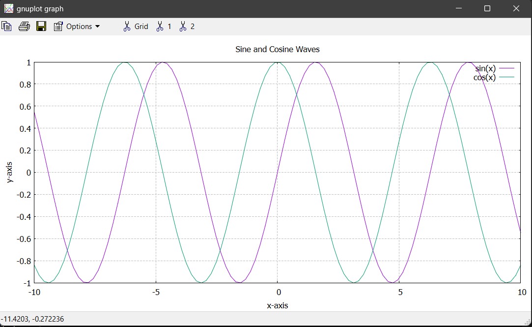
set title "Sine and Cosine Waves"
set xlabel "x-axis"
set ylabel "y-axis"
set grid
plot sin(x) with lines title "sin(x)", cos(x) with lines title "cos(x)"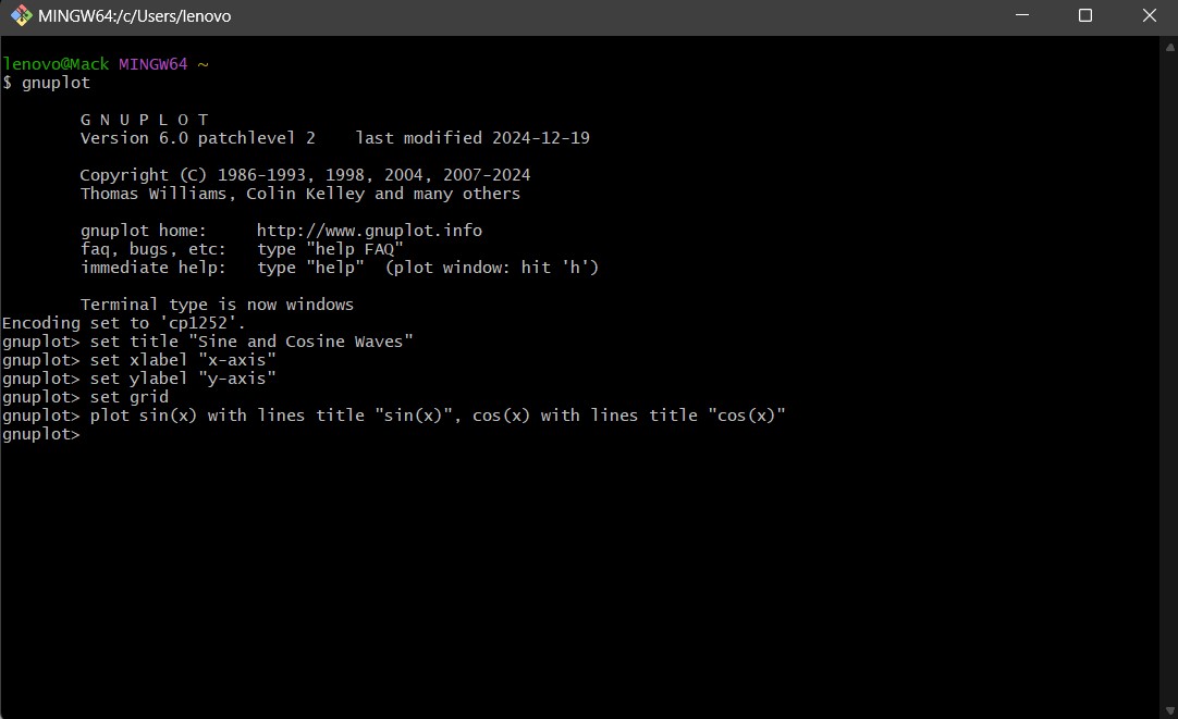
3d Surface Plot
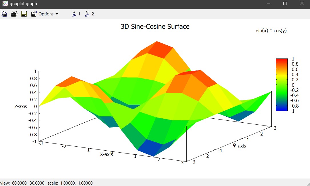
set title "3D Sine-Cosine Surface" font ",14"
set xlabel "X-axis"
set ylabel "Y-axis"
set zlabel "Z-axis"
set ticslevel 0
set pm3d at s
set dgrid3d 50,50
set hidden3d
set palette defined (0 "blue", 1 "green", 2 "yellow", 3 "red")
splot [-pi:pi] [-pi:pi] sin(x) * cos(y) with pm3d title "sin(x) * cos(y)"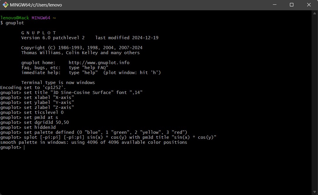
Histograms
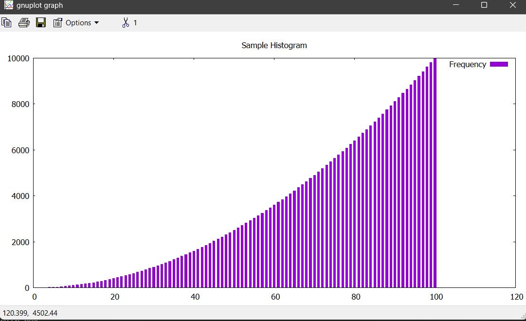
set boxwidth 0.5
set style fill solid
set title "Sample Histogram"
plot "data.txt" with boxes title "Frequency"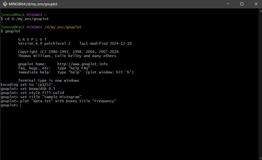
Scatter Plots
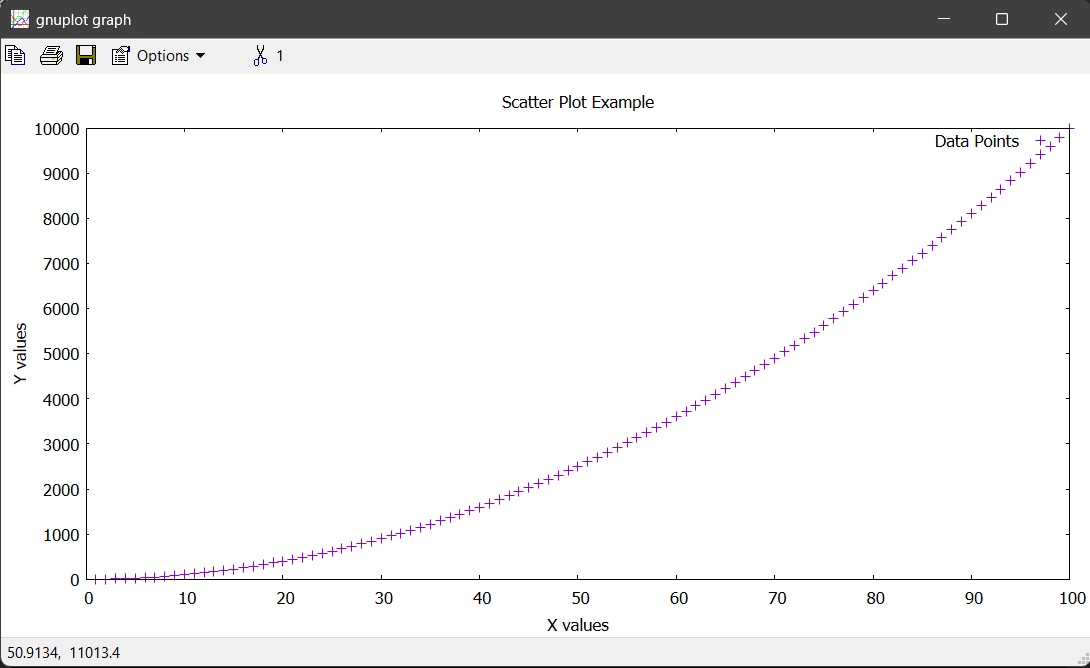
set title "Scatter Plot Example"
set xlabel "X values"
set ylabel "Y values"
plot "data.txt" using 1:2 with points title "Data Points"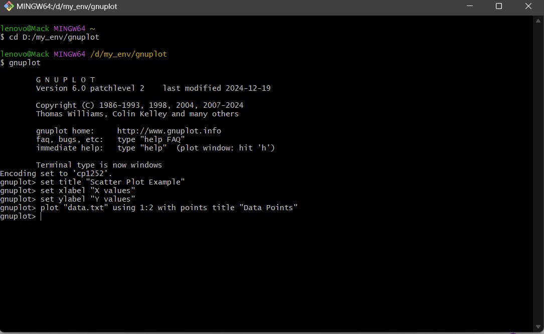
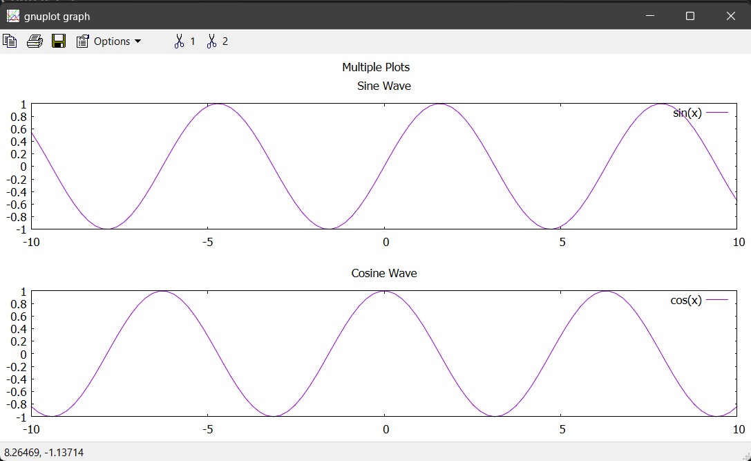
Multiple Plots
set multiplot layout 2,1 title "Multiple Plots"
set title "Sine Wave"
plot sin(x) with lines title "sin(x)"

set title "Cosine Wave"
plot cos(x) with lines title "cos(x)"
unset multiplot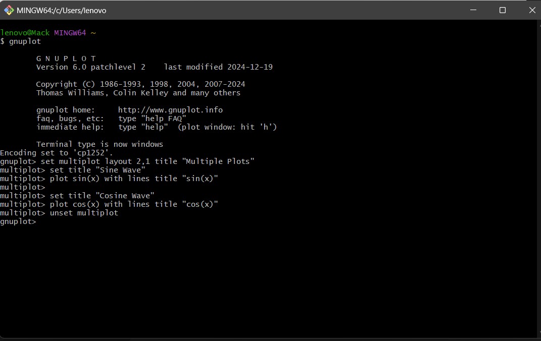
Practical Applications of Gnuplot (Use Cases)
Gnuplot is widely used across multiple fields due to its ability to handle large datasets, generate high-quality plots, and automate data visualization. Below are some real-world applications where Gnuplot is useful.
1. Scientific Research & Data Analysis
Visualizing experimental data in physics, chemistry, and biology becomes easier.
Example: A physicist analyzing the decay of radioactive isotopes using an exponential function plot.
- Gnuplot allows fitting experimental data to theoretical models.
- Supports error bars to represent uncertainties.
- Can generate publication-quality plots for research papers.
2. Engineering & Simulation
Helps in visualizing mechanical, electrical, and civil engineering simulations.
Example: Plotting stress-strain curves for material testing in mechanical engineering.
- Gnuplot can handle large numerical datasets from simulations.
- 3D plotting helps visualize surfaces and contour maps in Finite Element Analysis (FEA).
- Easily integrates with MATLAB, Python, and C for automated report generation.
3. Finance & Stock Market Analysis
Analyzing stock trends, market fluctuations, and economic data.
Example: Plotting stock prices over time and applying moving averages for trend analysis.
- Gnuplot can generate time-series plots for financial data.
- Allows plotting multiple indicators like moving averages, Bollinger Bands, and RSI.
- Automates daily/weekly analysis with scripting.
4. Weather and Climate Data Visualization
Analyzing temperature, humidity, and rainfall patterns over time.
Example: A meteorologist visualizing climate change trends over decades.
- Can plot multi-year temperature variations.
- Supports contour maps and 3D surface plots for visualizing geographical weather patterns.
- Automates daily weather data plotting using scripts.
5. Network & System Performance Monitoring
Monitoring CPU usage, network traffic, and server load.
Example: IT administrators plotting CPU usage and response times over time.
- Can read real-time data from log files and generate live-updating plots.
- Helps in detecting trends and anomalies in system performance.
- Automates report generation for system administrators.
6. Machine Learning & Data Science
Visualizing datasets, loss functions, and training progress of ML models.
Example: A data scientist plotting training loss vs. epochs to monitor model convergence.
- Provides a quick way to visualize loss functions, accuracy curves, and confusion matrices.
- Helps in feature engineering by plotting relationships between variables.
- Works well with Python for automated data visualization pipelines.
7. Robotics & Control Systems
Analyzing control system responses and sensor data by plotting step response, impulse response, and Bode plots.
Example: A robotics engineer plotting PID controller response over time.
- Helps in tuning control parameters by visualizing real-time sensor data.
- Works well with embedded systems that log data to text files.
8. Biomedical & Health Data Visualization
Analyzing patient health metrics, ECG signals, and medical test results.
Example: A doctor plotting a patient’s blood pressure trends over time.
- Handles time-series data for health monitoring.
- Supports smoothing functions for noisy biomedical data.
- Helps in detecting anomalies in patient vitals.
9. Geographical Data & GIS
Visualizing elevation maps, population distributions, and spatial data.
Example: A geologist plotting earthquake frequency based on geographic location.
- Can plot 3D terrain models from elevation data.
- Supports contour plotting for geographic heatmaps.
- Integrates with GIS tools for enhanced spatial analysis.
10. Embedded Systems & IoT Data Visualization
Monitoring IoT sensor data in smart cities and industrial automation.
Example: An engineer visualizing temperature readings from an IoT-based weather station.
- Continuously updates plots with real-time sensor data.
- Supports lightweight visualization for resource-constrained embedded systems.
- Allows automation of reports for industrial monitoring.
Concluding Remarks
Gnuplot is a powerful and flexible plotting tool widely used for visualizing data and mathematical functions. It supports multiple output formats, customization options, and scripting capabilities, making it suitable for both quick plots and complex visualizations.
Despite its many strengths, Gnuplot has some notable challenges and limitations. Its command-line interface and unique syntax present a steep learning curve, making it less accessible to beginners compared to modern GUI-based plotting tools. While it offers powerful customization, it lacks extensive interactive features, making it less intuitive for real-time data exploration. Additionally, Gnuplot is primarily a visualization tool and does not provide built-in advanced data analysis capabilities, often requiring users to preprocess data with other software before plotting. The community, while active, is smaller than that of newer libraries like Matplotlib or Plotly, making it harder to find support for niche problems. Lastly, while it supports multiple output formats, Gnuplot’s graphics may not always match the aesthetic appeal of more modern plotting tools unless carefully fine-tuned.
Overall, Gnuplot remains a valuable tool for scientists, engineers, and analysts who need efficient and high-quality graphing capabilities in a lightweight package.
References & Further Reading
To further enhance your knowledge of GNU Plot, visit the following resources:
- Official GNU Plot Website: http://www.gnuplot.info
- GNU Plot Documentation: http://gnuplot.info/documentation.html
- GNU Plot Quick Reference Guide: https://gnuplot.sourceforge.net
Books & Tutorials:
- Gnuplot in Action by Philipp K. Janert
- Online tutorials on platforms like Tutorialspoint, Overleaf, and Stack Overflow
Community & Support:
- GNU Plot mailing lists
- GitHub and Stack Overflow forums